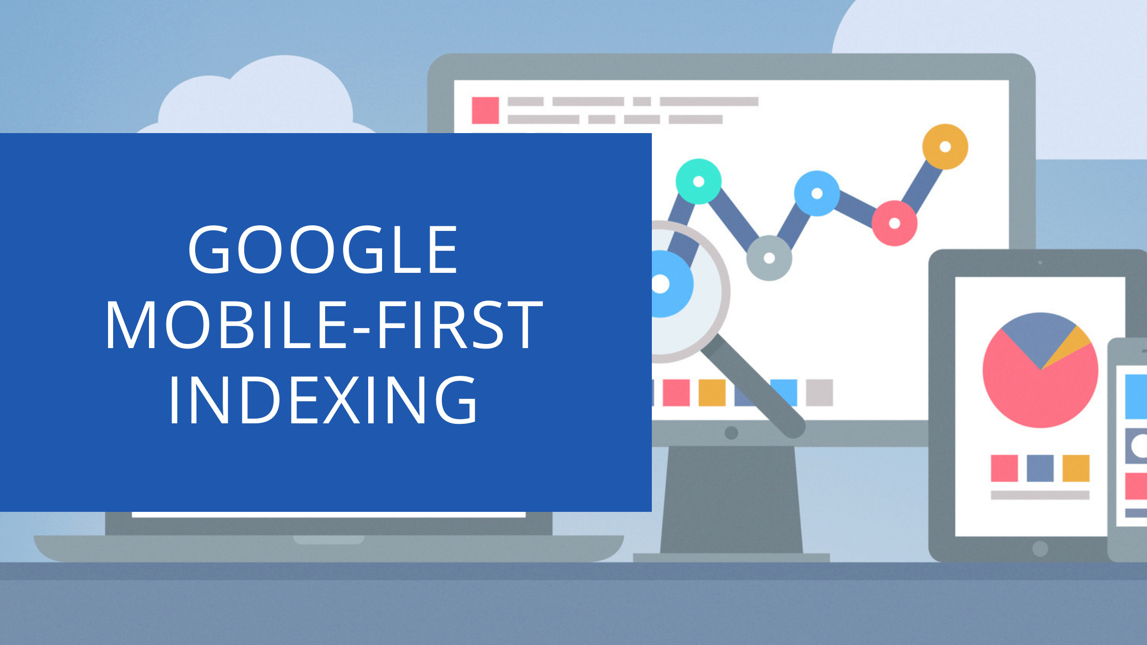
Google officially announced that they will be rolling out their mobile-first indexing. What does this mean? This means that Google will now rank websites and pages in search results based on the content available to a user when they are using a smartphone or tablet.
This is significant because it changes how you need to optimise your website for both desktop and mobile users, especially if you want higher rankings in organic searches. In this guide, we’ll take an in-depth look at what Google’s Mobile-first Indexing means for you!
Contents
What is Google Mobile-first Indexing?
Google Mobile-first Indexing is a change to how Googlebot crawls and indexes websites. Previously, Google would crawl and index the desktop version of a website first, then look at the mobile version to see if there were any changes or updates. With Mobile-first Indexing, Google will now index the mobile version of a website first, then look at the desktop version.
With this change, Google will index the mobile version of a website first and show it in search results on mobile devices – even if there is a different URL for that page on your site’s desktop or mobile versions!
How Does Google Mobile-first Indexing Works?
 To make sure that the mobile version of a website has been crawled and indexed by Googlebot first, it’s important to understand how your pages can be accessed on smartphones or tablet devices.
When Googlebot crawls a site, it will first see if there is a separate mobile URL for that page (e.g., m.example.com). If so, Googlebot will crawl this instead and index the content from there – which is why it’s important to ensure that your mobile site has all of the same content as your desktop site.
If there isn’t a separate mobile URL for that page, Googlebot will crawl the desktop URL and index the content from there. This will allow Googlebot to index both versions of each URL, but rank pages primarily based on the mobile version.
Your website should be able to detect if a user is accessing it from an iPhone or iPad and redirect them to the mobile version of your site, or for best practice, you should be using responsive website design – which means your website should adapt to the size of a user’s screen.
You should still make sure that your website is optimised, mobile-friendly, and provides a good user experience for those accessing it on smartphones or tablets.
What You Need to Know About Google Mobile-first Indexing
To ensure that your website is ready for Google Mobile-first Indexing, there are a few things that you need to know:
- Google looks at the content of your mobile page.
- Make sure that all URLs are crawled correctly. You want to make it easy for Googlebot to crawl your website, so make sure that all of your pages have the correct canonical tags and are accessible from smartphones or tablets.
- Googlebot will still crawl your desktop site! Just because Google is now indexing mobile content doesn’t mean that you should stop optimising your website for desktop users. You should continue to do so as Google still makes use of the desktop version of a site in its ranking.
Mobile Optimisation Tips
Page Speeds
Make sure that your website is optimised for page speeds, as this will have a significant impact on the user experience. You can use the following tools to help you:
- Google PageSpeed Insights
- GTmetrix
- YSlow
Responsive Design
To make sure that your website is mobile-friendly, you should be using a responsive design. This means that your website will adapt to the size of a user’s screen and provide an optimal experience for all users on smartphones or tablets.
There are many plug-ins available that will help you to achieve a responsive design with minimal fuss. The most common are PHP or .net based plugins that are found on WordPress, Drupal, or Joomla hosting. You could also have your website rebuilt by a web designer.
User Experience
Make sure that your website is easy to use on smartphones and tablets. Use smaller fonts, avoid using Flash, and make sure all of your links are easily accessible.
You can also test your website’s user experience on different devices using the Google Mobile-friendly Test Tool.
Mobile page speed is one of the key factors in how your web pages will rank on Google.
Tools like GTmetrix can be used to test your page speeds for mobile, while PageSpeed Insights will provide feedback on potential improvements you could make.
General issues include reducing the total download size of your website objects (e.g., media files), eliminating render-blocking JavaScript and CSS in above-the-fold content, minifying resources, and deferring offscreen images.
You should make sure that your URLs are crawlable and have the correct canonical tags. The following tools can help you with this:
- Google Search Console (Webmaster Tools)
- Screaming Frog
- Beam Us Up: SEO Crawling Software
How to check for crawl errors in Google Search Console:
- Login to Google Search Console
- Choose the domain you want to investigate
- Select Index > Coverage > Errors
- Check the list of URLs with errors and click on them for further details
- Once the issues have been fixed, click on start “Start Validation”
Here are some of the crawl errors that Google Search Console shows:
- Server Error (5xx)
- Redirect Error
- Blocked by robots.txt
- Submitted URL marked ‘noindex’
- Soft 404
- Unauthorized request (401)
- Not Found (404)
- Crawl Issue
Accelerated Mobile Pages (AMP)
Google is pushing for the adoption of Accelerated Mobile Pages (AMP), which is an open-source project that allows web developers to create mobile-friendly pages that load quickly. Google will index these pages and place a cached version of the page in its search results.
 An AMP URL looks like this: example.com/amp/url-path/. This is different from your desktop site which usually looks something like this: example.com/page-name.
There are a few ways that you can make your website AMP-ready. You can use a plugin, such as the AMP for WordPress Plugin, which will automatically convert all of your pages to AMP. You can also use the Google AMP Cache to host and serve your pages.
If you’re using a CMS (content management system), such as WordPress, Drupal, or Joomla, then there are likely AMP plugins available that you can use. You can also check out the acceleration guidelines on the AMP Project website.
To verify that your site is properly configured for Accelerated Mobile Pages, you can use the Google AMP Test tool.
NOTE: AMP is not required for all types of sites.
Check the placement of your ads
If you’re using ads on your website, make sure that they are placed correctly for mobile users. Ads that are too close to the edge of a user’s screen can be annoying and disrupt the user experience. You should also test how your website looks on different devices to ensure that all of your ads are being displayed correctly.
Google has released a Mobile Ads Sizing Guide that you can use to check the placement of your ads on different devices.
Google has announced an interstitial penalty for websites that display pop-ups to mobile users or ads they deem “intrusive”. This means that Google may not index pages where it detects these types of pop-up adverts, which can be frustrating if you rely on search engine traffic.
Mobile-first Indexing FAQ
What is Mobile-first indexing?
Mobile-first indexing is the process of Googlebot primarily using the mobile version of a website for indexing and ranking.
Will my site still be indexed if it’s not Mobile-friendly?
If your website is not Mobile-friendly, then it can still be indexed by Google but you will miss out on a lot of signals that can help push your rankings and traffic. You can use the Google Mobile-friendly test to check if your website is Mobile-friendly.
What is the difference between Mobile-first indexing and a mobile site?
 A mobile site is a separate website that is designed for users on mobile devices. Mobile sites are often smaller and simpler than their desktop counterparts. With Mobile-first indexing, Google will use the mobile version of your website for indexing and ranking, regardless of whether you have a separate mobile site or not.
Does mobile-first mean any ads will be penalised?
No, Google will not penalise ads on mobile devices, but you could be if they are deemed “intrusive”. check if your ads are being displayed correctly on different devices.
How do I make my website Mobile-friendly?
You can use a different theme if you are using a content management system like WordPress, or you can have a web designer redesign your website, or if your site and visitors can benefit from AMP you can use a plugin, such as the AMP for WordPress Plugin, which will automatically convert all of your pages to AMP.
We Offer SEO Services Nationwide
- Chester:https://mediakynect.co.uk/seo-chester/
- Wirral: https://mediakynect.co.uk/seo-wirral/
- Liverpool: https://mediakynect.co.uk/seo-liverpool/
- North Wales: https://mediakynect.co.uk/seo-north-wales/
- Wrexham: https://mediakynect.co.uk/seo-wrexham/
Conclusion
Google Mobile-first Indexing has changed how Googlebot crawls and indexes websites. With this change, Google will index the mobile version of a website first – even if there is a different URL for that page on your site’s desktop or mobile versions!
To ensure that your website is ready, it’s important to make sure that all of your pages are crawlable by Googlebot and provide a good user experience for those accessing it from smartphones or tablets. You should also be using a responsive design to make sure that your website looks good on all devices.